Even after four years of programming, the New York storefront P! has managed to elude any form of archetypal gallery classification. The freewheeling spirit of P! can be attributed to its founder, Prem Krishnamurthy, whom many reading this blog know from his graphic design studio, Project Projects. Prem’s profound understanding of both graphic design and curating elucidates interesting relationships between the two disciplines. In each show Prem makes it a priority to juxtapose work from a spectrum of fields in order to question boundaries and reveal connections between seemingly disparate practices. It is this sort of inter-disciplinary approach in P!’s programming that we at the Walker design studio find so engaging.
If you’ve unwittingly happened upon the space over the years, you are just as likely to find a reading room, experimental techno celebration, or currency exchange station. In response to the diversity of work, the architecture of P! finds itself an active collaborator; evolving to create a unique spatial context for each show. At one point this meant a green ceiling under the guidance of a feng shui master; at another, it evolved into a new gallery altogether under the name K. Kicking off the final season in the storefront is the exhibition Karel Martens, Recent Work. The show is an appropriate bookend, not only because of Martens’s participation in the inaugural P! show, Process 01: Joy (2012) but the way many of his pieces occupy the ambiguous ground between graphic design and contemporary art.
In the following interview we discuss Recent Work, the relationship between Prem’s design and curatorial practice, and what’s next for P! after the storefront.
Ben Schwartz: To begin, could you tell us a bit about putting together the current show, Karel Martens, Recent Work? Given Martens’s history with printed matter, I’m particularly curious about the inclusion of a sculptural piece as well as a video installation.
Prem Krishnamurthy: I’ve worked with Karel now a number of times. He was included in the first show at P!, Process 01: Joy, and was one of the reasons why I opened a gallery in the first place. Since that initial exhibition, we’ve worked on a number of other projects and presentations of his work in other venues, but this is his first solo show at P!
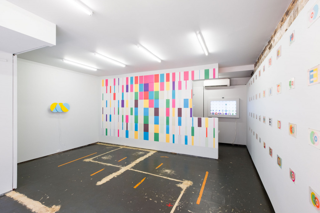
Our past projects with Karel have focused primarily on his letterpress monoprints, his best known works apart from his commissioned graphic design. Although Karel has always worked across media and scales, there hasn’t been a venue for these works to be shown. We’ve been developing Recent Work together for nearly a year; the longer timeframe presented an opportunity for Karel to think through his work since the 1950s and pick up on a number of strands that he’s wanted to develop further. For example: the clock piece, Three Times (in Blue and Yellow), is a new work but its origins range back to Karel’s early kinetic clock works of the 1960s. And the interactive installation, Icon Viewer, is an extension of the custom icon-pixel language that Karel developed nearly 15 years ago. So there is an incredible amount of continuity within the work.
One of the things that I admire about Karel’s practice is that he has embraced technology with a sense of openness and curiosity. Although graphic design has changed radically over the nearly 60 years since he started, Karel has adopted successive tools and continued to stay on top of contemporary methods. This has allowed him to push his ideas about color, pattern, reproduction, and form further, so that they don’t remain static, and to experiment in different dimensions and media.
BS: In past shows P!’s role has extended beyond what one would typically expect from a gallery. In many ways the space becomes an active element that works in tandem with the artist. Would you consider Recent Work a collaborative effort?
PK: This raises the open-ended question around the place of design and curating within the broader realm of artistic production. P!’s role—as well as my own—in a given exhibition modulates greatly based on the circumstances. In some exhibitions, we have a strong hand in formulating the initial framework and creating the context that brings everything together. In this exhibition, as in other solo presentations, our role was quieter yet still present.
Karel’s exhibition emerged from the start as a dialogue between us, but with his practice, rather than a discrete curatorial premise, at its center. We’ve been in close conversation from the start to decide how to approach the exhibition, what works to display, and how to show them. Together we made models, plans, and elevations of the exhibition, batted around ideas for each part of the show, determined which new works needed to be produced, and edited down from a larger a set of works and projects. However, Karel is ultimately the author of the work and exhibition.
At the same time, I think that this particular show couldn’t have taken place right now in another space, whether in New York or elsewhere. It represents a confluence of Karel’s work and the unique profile of P!, along with my approach to curating exhibitions. Together they generate a situation that goes beyond the individual components.
BS: You and Karel seem to have a very close relationship. Over the years, what have you learned from him as both a curator and a designer?
PK: Each of the artists whom I work closely with at P! challenges my ideas and forces me to grow. I’m thinking here of Céline Condorelli, Aaron Gemmill, Mathew Hale, Maryam Jafri, Christopher Kulendran Thomas, Wong Kit Yi, and many others. I’ve also had the pleasure of exhibiting figures from an older generation—designers, artists, writers, musicians, and more—who have been fundamental to my own thinking. I consider myself lucky to have had a chance to learn from their deep experience and wisdom, while also exposing them to new audiences and approaches. This includes not only Karel, but also Brian O’Doherty and Elaine Lustig Cohen. I am terribly sad that Elaine just passed away recently, but she remains an ongoing inspiration for me through her unique work, life, and generous embrace of new ideas.
Over these past years, Karel has taught me a lot. Some things are practical and aesthetic: for example, how he thinks about hanging a show, which is very related to how he arranges a layout on a page. Rather than hanging a show according to classical curatorial or museum approaches, he uses other structures like grids and margins, which give his installations an unusual energy and freshness.
A more fundamental thing that I’ve learned from working with Karel is how he likes to leave some things unfinished and open-ended. I can tend to be very, very structured and try to control nearly ever detail. Working with Karel, I’ve observed his tendency to be precise about certain aspects of a piece or exhibition but quite relaxed about others. I think this is what allows the work to breathe.
For this show, we were trying to settle on the order of the monoprints in the wall grid. As we laid them down to look, I began to shuffle them around in order to achieve the “perfect sequence.” I was attempting to account for their size, color, formal relationships, and other variables. After a while, Karel said, “Prem, it’s done. Don’t worry so much about it. They’ll all look good next to each other.” I protested and tried to keep fiddling with it, but eventually had to admit that he was right.
Karel also has a Dutch sense of work/life balance—so he tends get a beer or dinner at 6 pm, even if he comes back to the studio or exhibition space later on. I’m still trying to learn from him here, too!
BS: I’ve always loved that about his personal work, the way intuition and spontaneity play a large role in his process. Each move is a reaction to what’s already on the page and to what he’s feeling at a particular moment. The decision-making process seems oppositional to graphic design, where there is the need to justify every aesthetic move.
PK: You’re right, but it’s a specific case with Karel. He’s been working for nearly 60 years and so is truly a master of his field. Even his intuitive decisions about form, color, and typography arrive with an incredible degree of innate practice and knowledge.
When I was younger, I used to be a real perfectionist as a typographer. I wanted even the most basic typesetting to be absolutely precise and complete. Something I’m working on in my design and curatorial practice is to have more trust and confidence, to let go just a little bit. Chris Wu, whom I work with at Project Projects, tried to convince me years ago that great design is sometimes all about the gesture—just the right gesture can work perfectly.
The question of context and what’s already on the page is also very significant here. For Karel, as for myself, there is an interest in what exists before one steps into a given situation as a graphic designer. This happens with his monoprints: he chooses to print on things that already have a past life and a formal order. It’s a kind of recycling but also a response to something that’s already there. For me, it’s about a sense of making history visible.
Several years ago, I was leading the design of the signage program for the Yale University Art Gallery. There had already been a number of signage programs that had existed over the years before we were commissioned. Rather than approaching the project by starting from scratch, I decided that we would retain aspects of those older signage programs, layering our own system on top. This lends the viewer a richer sense of what’s been there before, and what’s still to come.
This is how I approach exhibition spaces, too. I don’t look at the gallery space as being a tabula rasa, blank slate, or white cube. One aspect of my exhibition-making is that I consider the architecture and history of a space as inflecting whatever’s displayed in it. A show in a gallery is just one more archaeological layer added to the top.
When preparing P!’s space for its final year of programming, I opted to remove a cork floor that had existed since early 2015 and expose the floor panels below. In doing so, I realized that they are nearly a work in their own right. The vinyl flooring, which has been here since I took the lease, makes visible a history of the past floorplans of the storefront, and how it has changed over these past four years. While installing Karel’s show, I recognized the connection for the first time: the way that I treat existing spaces relates directly to how Karel overprints on existing cards and ephemera. Both are a form of palimpsest, just in different dimensions and scales.
BS: For Karel, I’m curious about what he’s responding to on the found material. Is he paying attention to content or is he more focused on formal relationships?
PK: He describes it as being a combination of both aspects. On the one hand, he doesn’t like to print something with a direct relationship to what’s already on the card, as it can result in feeling too illustrative. On the other hand, as he mentioned in the New York Times T Magazine, he sees the typewriting and tabular typography on the found cards as being a form of concrete poetry—the poetry of administration—which inspires him to print on top of them.
BS: I think this current show of Karel Martens occupies an interesting space in regards to graphic design and contemporary art. Karel is of course a seminal graphic designer, but the work being shown is uncommissioned. Did you ever feel the need to make the distinction between design and art when putting together Recent Work?
PK: I don’t make that distinction; rather, I try to look at the unique values and qualities of objects, regardless of what genre they belong to. Karel is foundational to the program of P! because he occupies this ambiguous ground between art and design. He makes works that are not commissioned, but sometimes the forms that he create in his monoprints make their way back into his commissioned graphic design work. There is a healthy back and forth. Both his commissioned and uncommissioned works are equally beautiful.
In Karel’s case, I see this as a kind of visual research. He’s spent the last 60 years experimenting with form and color, constituting a body of knowledge and practice that flows into all of his different work. In this way, he occupies an in-between space. For much of the history of the 20th century avant-garde, there wasn’t a strong distinction between applied and “free work.” This overlap, exemplified in Karel’s work today, is at the heart of my interests and why I wanted to include him in P!’s program from the first show. We’re in a historical era in which there is a strong boundary established between disciplines—which has much less to do with intrinsic distinctions and much more to do with the market and how different kinds of labor are currently valued.
I always ask myself with Karel’s work and that of others I’m interested in: Who cares whether people call it graphic design or art right now, but what’s this going to look like in 50, 100, or 1,000 years? Many of the things that we value most from past generations may have once been functional, whether they’re pottery, printed remnants, or cave paintings. They had one relevance in their original moment but they’ve also maintained their integrity. Their relevance to us now is that they have acquired a new meaning, which is in excess of the original purpose.
On a panel that I organized recently at the New York Art Book Fair 2016 with Karel and David Reinfurt (of Dexter Sinister and O-R-G), Karel said something that really resonated with me. To paraphrase him, if you’re making a piece of graphic design and you’ve just fulfilled the project’s assignment, then you’ve only done half of the work. There is a large part of design that goes beyond functional requirements; perhaps this aspect contributes to what makes the work enduring in the long term.
BS: Although you mentioned not looking at a hard and fast line between graphic design and fine art, with P! do you feel a particular responsibility to give graphic design more representation in the gallery space?
PK: Since I come from a background in graphic design, it’s one of the key contexts and bodies of knowledge that I carry with me everywhere I go. Graphic design is an embedded filter for how I think about the world. In a broader sense, the history of graphic design is extremely intertwined with larger narratives of historical and contemporary visual practice. It’s impossible to disentangle design from how we look at art since the beginning of the 20th century. Beyond the crossover of the disciplines and practitioners, even the reproduction, publication, and dissemination of art has been traditionally mediated through graphic design.
When I consider what to place into an exhibition space, it’s quite natural to me for those things to come from the different worlds with which I engage, whether contemporary art, graphic design, music, or writing. However, with graphic design in particular, I have tended to come at it from two directions. Sometimes I’ll show things from a graphic design context that I think are compelling within a broader discourse; other times, I present contemporary art projects that might resonate with graphic design in a significant way.
In this latter category, I have in mind exhibitions we’ve done with artists such as Vahap Avşar, who worked with the archive of a defunct Turkish postcard company to make new postcards for distribution. Another example is Maryam Jafri, who examines histories of consumer products from an anthropological and artistic perspective. Her show at P!, Economy Corner—I think one of our best—was an exhibition about economics, branding, markets, and class, while also being legible as a show about typography, even if that’s not Maryam’s primary interest. Another crucial show for me from our fourth season was Pangrammar, a freewheeling and highly personal exhibition that mapped my interests in the overlaps between typography and art in a loose, associative way. By mixing works that were art and design, new and old, unique and multiples, within a single idiosyncratic curatorial structure, it gestured towards the more open-ended yet critical ways I’d like these fields to be looked at.
BS: When you do include graphic design in particular shows, it’s never really looking inwards at the practice itself. I’m thinking of the Anton Stankowski and Klaus Wittkugel show; although both graphic designers, the work seemed to point outward toward larger ideas about East and West Germany. The display of graphic design seems very different than say, Graphic Design: Now in Production here at The Walker. How does bringing design into a gallery context change the viewer’s relationship with the work?
PK: It’s good that you bring up Graphic Design: Now in Production. As you know, Project Projects collaborated with the Walker on the graphic identity of the show; I then directed the exhibition design for its New York presentation by the Cooper Hewitt. In fact, the show immediately preceded P!’s opening and surely influenced some of my decisions. Curated by Andrew Blauvelt and Ellen Lupton along with a team of others, Graphic Design: Now in Production took a more classical approach to displaying graphic design, organizing it according to projects, specific media types, and functionality.
This is quite different from my curatorial approach. For me, context is extremely important in looking at design objects—for whom and why was something made?—but I’m equally compelled by a work’s broader significance, whether aesthetic, conceptual, cultural, or ideological. The challenge is how to make these registers legible within the exhibition setting, which I’ve tried to address in a number of ways. The Wittkugel / Stankowski exhibition was one approach, which involved using particular strategies of contemporary art display to present historical graphic design work, freeing it from some of its baggage while also situating it within broader political discourses.
I’m committed to an approach to presenting design that does not separate it from other fields of visual and artistic inquiry. That’s not to say that there are no differences between these disciplines, but rather that I’m interested in their confluences. I take issue both with how graphic design is exhibited in a closed-off way, but also with recent exhibitions of early 20th-century avant-garde figures that focus primarily on their paintings or their sculptures, when they made equally important contributions in graphic design, photography, exhibition design, and beyond. By relegating these practitioners’ “applied” work to a secondary status, the exhibitions are actually undoing in large part their intended legacies.
Recently I heard someone voice that typical refrain: “Oh, I wonder if graphic design is still going to exist in 20 years.” I’d bet that it will, but that it will look quite different than it does now. Rather than navel-gazing, I’m interested in graphic design’s potential to look outside of itself to connect with other discourses.
BS: As this is the last year of P! in its physical manifestation, I want to go back and discuss some of the history of the space. As you mentioned, the first exhibition was Process 01: Joy which explored the relationship between joy and practice. In the context of your own work, how has P! been a source of joy for you?
PK: Framing the first show at P! in this particular way was both self-reflective and self-deprecating. After all, opening P! alongside my work at Project Projects, my teaching, my writing, and everything else was basically a choice to double or triple my workload! And then to focus first show around labor and name it Joy was also a slightly perverse joke. But it also had a very serious dimension. All three of the participants in that first show—Chauncey Hare, Christine Hill, and Karel Martens—had explored, both implicitly and explicitly, the complex relationship between vocations and avocations, labor and pleasure. The show embraced the fact that much of the most significant work, of any kind, falls outside of the typical 9-to-5 workday, while being part of a dialectic with this economy of production.
What creative people produce to make a living is often circumscribed into very specific categories. After the show, I began to look at what works from somebody’s practice might be marginalized, and hone in on those. If P! has, in part, created a home for people’s “off-projects” that don’t fit in neatly with what they’re necessarily known for, then I’d be happy.
P! was an activity that complemented my work as a graphic designer at Project Projects, and it was a project of love. On the other hand, I can’t overestimate how much it has influenced my own graphic design over the past four years, as much as the space has been informed by the work I had accomplished before it.
BS: That’s actually a point I wanted to touch on: the relationship between your curatorial practice and graphic design practice. How have the two influenced each other?
PK: For a number of years, I’ve been planning to write a longer text or at least put together a lecture about the relationship of curating and design. Maybe I’ll have more time to finish this once P! on Broome Street closes! I hold that the two fields—graphic design and curating—are quite similar in a number of historical, structural, and practical ways. Both disciplines are focused on mediating content rather than necessarily generating it themselves. Curators and graphic designers alike work with other people, other objects, other ideas that are outside of themselves—they’re exogenous pursuits.
As a graphic designer, you work with your clients to make their content legible for a set of publics. As a curator, you working with artists to translate their work and interests to a broader audience outside of their studio.
BS: We talked a bit about collaboration. The collaborative dynamic seems at the heart of both P! and Project Projects. In your design practice Project Projects seems involved at a much deeper level than a traditional designer/client relationship. P!’s involvement as well goes beyond the traditional white cube approach. Can you talk about P!’s unique curatorial point of view?
PK: From the beginning, I’ve always thought of the space itself as an actor. This is both with regards to P! and more generally when I’m designing and curating exhibitions in other venues. One of my fundamental texts is Brian O’Doherty’s Inside the White Cube. It dates back to 1976, but Brian’s argument still reads quite true, 40 years later.
I believe that the context of presentation, the architecture and the display of an exhibition, can be as meaningful as what’s being shown. One of the first decisions I made when after I signed the lease for 334 Broome Street was to talk with Leong Leong, the architecture firm whom I had brought in to work with Project Projects on Graphic Design: Now in Production in New York (and who now share a studio space with us). They designed the space in a brilliant way—both functional and conceptual, overt and subtle in the right ways. Their original design also highlighted the context of the storefront space and its previous life, a Chinatown HVAC contracting office. Over the years, as the space has developed through the interventions of artists and my own curatorial ideas, Leong Leong has remained involved in the conversations around how the space evolves.
More broadly, apart from simply trying to foreground mediation, architecture, and display, I have a strong belief about self-reflexivity and transparency: since curating is a discipline that makes things visible yet also orders the world according to its own agendas, the curatorial act—the very process of framing—ought to itself be laid bare.
One of Brian’s core arguments from Inside the White Cube is that the white cube gallery makes nearly anything displayed inside of it into a kind of sacral object, increasing its market value. As a counter to this kind of invisible conditioning, I’m interested in trying to expose for the viewer how such operations construct values.
This is also something that figures into much of my design work. For me, the challenge is not just to make a compelling identity, book, exhibition, or website that presents its content in a neutral way, but to also design it in such a way that makes the viewer aware of its own mediation and influence. Undermining one’s own authority—or at least, calling it into question—is an important quality.
BS: In regards to making things visible, I feel like a lot of that is coming from playing with the context of various disciplines. Placing work in a gallery that may not typically exist there, but also with other practices it may not normally exist alongside. For example, in Permutation 03.4: Re-Mix you put Thomas Brinkmann, a DJ, alongside visual artists Katarina Burin and Semir Alschausky, the architectural practice Fake Industries Architectural Agonism, and a video essay by Oliver Laric. In creating these sorts of experiments in recontextualization, what are you hoping to communicate?
PK: Thank you for reminding me of that show, the last show of our very first year. It feels like such a long time ago! It was a pretty important exhibition to me. It brings up similar questions around how context and juxtaposition affect the meaning of individual objects. This particular show was also the conclusion of a four-exhibition cycle examining ideas of copying, authorship, and originality. The series had a looping structure in which artworks, idea, and specific display strategies echoed each other across shows.
Through my work as a graphic designer—but also through other interests, including filmic montage and psychoanalysis—I’ve learned to work with the principle of juxtaposition: if you show multiple objects within the same frame, whether on a page, in a space, or within a limited time period, a connection will be formed between them in the viewer’s mind.
This particular exhibition suggested a set of conceptual, formal, and methodological relationships between the disparate participants. Thomas Brinkmann is an experimental DJ and musician who had originally studied art and who has worked in a way that resonates with contemporary art practice. In the exhibition, he showed a custom two-armed turntable that he developed in the late 1980s, which can “double” an audio track in a specific way; at the same time, its unique fabrication evokes a Russian Constructivist sculpture. Katarina Burin had developed a fictional female designer of the Eastern European avant-garde whose architectural drawings resonated formally with Brinkmann’s work while similarly challenging notions of the copy and the original. Semir Alschausky premiered an unusual and intricate painting on paper that remakes a well-known historical painting using a technique resembling the circular grooves of a record. Subverting the entire frame of presentation, Fake Industries Architectural Agonism appropriated the temporal structure of a recent exhibition at a nearby gallery, in which an artist had shifted the opening hours of the gallery to dusk; Fake Industries simply changed P!’s hours to mirror those (which meant we were open into the evening, appropriate for the musical context of Brinkmann’s work). Finally, Oliver Laric’s piece was a kind of cover version of a cover version: his essay film Versions had appeared in an earlier exhibition of the cycle. Here, an adaptation of the film into a musical play by students at the Juilliard Academy played on a screen, in nearly the same position where it had appeared two shows earlier. A kind of uncanny doubling, taking place over time.
In any case, that’s just scratching the surface. There are other ways in which the works spoke to each other. It’s like a lively dinner party: the most fun ones include people who are more different than alike!
BS: This season marks the last season for P! in the Broome Street space. I feel like the storefront has played such a major role in many exhibitions, and its location in Chinatown seems to be an important factor. What does the move mean for P!? Does it have to do with a shift in ideology or is it more related to logistics?
PK: A “move” is a slight misnomer insofar as we are not announcing a new location after this, at least not for now. It’s actually more that P! is shifting its focus. For its first five years, P! existed primarily as an exhibition program housed in a single location, with occasional off-site presentations and projects. Moving forward, P! will take the shape of a dispersed institution that can assume and inhabit different spaces through its programmatic focus. It will still organize exhibitions and presentations, collaborating with museums and other venues. P! will also continue to work with artists, designers, and others on these shows as well as on producing publications. So it’s more of an opening-up of the focus of the organization.
P! as a storefront in Chinatown was always intended as a “limited-time offering,” with a start and end date. This accompanies the strong narrative component to its program thus far. Each of the past seasons or years of the space have had a specific structure and arc to them; this even includes the fact that we changed the name of the gallery for a five-month period, becoming another gallery, K. I thought of that moment as our version of a “play-within-a-play.” And as with a literary work, there may be an ending, but that doesn’t preclude sequels and continuations.
BS: It seems to me that P! has always been about evolution, whether that be through a changing architecture or a flexible identity system. Now, to not even be tied down to a specific location seems like a logical progression in regards to what’s next.
PK: Yes. P! has also represented an exploration of a different mode of “institutionality.” It’s an outgrowth of my many years of work with institutions, especially those that have an unusual, non-normative shape—such as SALT in Istanbul or the Berkeley Art Museum/Pacific Film Archive’s MATRIX project space. I’ve made this part of my program at P!, allowing it to constantly shift its profile and visual identity, so that it might appear as something quite different to its various audiences.
Bricks-and-mortar spaces are only one aspect of a contemporary institution. While I’m still committed to exhibition-making, the next institutional challenge is how to disperse activities and programming yet still maintain an audience and a community.
BS: To close things out, I want to ask a bit of a sentimental question. With any sort of major milestone I think it’s important to look back on what has been accomplished. Are there any particular memories that stand out to you during your time at the Broome Street location?
PK: I liked your question about Thomas Brinkmann and the exhibition Permutation 03.4: Re-Mix. For the opening of that show, there was a special performance where Thomas invited his New York friends to bring records to play on his special double-armed record player. Each original record was transformed into something like a slow, dub-inflected shuffle, with a tremendous sense of stuttering rhythm. It turned into an incredible, dance-floor moment, with everyone anticipating what would come next. The floor seemed like it might collapse. It was such a special moment, I remember thinking, we could end P! right now, and it would have all been worth it. We’ve already accomplished in a microcosm what we originally set out to do: to bring people who would never otherwise know each other into a space together, and to create a dialogue.
BS: I want to really thank you for your time. It’s been exciting following what you’ve been doing with P!, and it has been a real inspiration. Congratulations again on such an amazing body of work, I’m looking forward to what’s next.